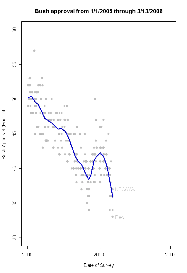
Charles Franklin has updated his job approval graphic to include the new surveys from the Pew Research Center and NBC/Wall Street Journal. It is well worth reading in full, but here’s the money quote:
The effect of these and other recent polls is to lower my estimated
approval to 35.9%., down over 6 percentage points since the new year
began. A new low (with apologies to MP!) The difference between MPs
analysis of change in the individual polls and mine is that I’m
accumulating the evidence across all polls, and collectively they are
implying that the “true” level of support continues to fall. I’ve written previously on the problem of spacing between polls here.
At this point, President Bush’s approval is falling 1% each 12.5 days,
the most rapid decline of his presidency. If a poll has a 3% margin of
error, we’d only observe a statistically significant change in that
poll over a 38 day interval. Hence most changes in polls taken only a
week or two apart are not statistically significant even if they are
following the same rate of decline. The accumulated evidence across all
the polls is a better estimate of the trend in approval, and is
reflected in my blue trend line in the figure. Even
so, day-to-day movements are not statistically significant, so I agree
with MP that it probably shouldn’t be headline news that a “new low”
has been reached every day, simply because the trend is continuing
down. By definition if the trend is down and you’ve passed the
previous low, then every day is a “new low”. Perhaps better to focus on
the trend than the new record lows.
This is Franklin’s graph (click on it to see the full-size version):

As Robert Chung puts it in a comment on Franklin’s blog, this is “not a simple problem.” I do wonder if the spacing of polls in this case helps create the impression of a gradual “week-to-week” sinking when the real change may have been an abrupt decline in late February in the wake of news about the UAE ports deal (beginning the weekend of Feb. 18-19) and about the chaos in Iraq following the bombing of the Samarra mosque (on Feb. 22). When I looked at polls conducted between early December and Early February, I saw no trend in the Bush job rating. Obviously, all of the polls conducted since mid February show a decline 3 to 8 points depending on the pollster. The very few organizations that have polled twice since mid-February (which as of this morning includes an update from Fox News) also show no significant trend over the last 2-3 weeks. If we connect the dots before and after mid-February — whether one pollster at a time as in yesterday’s graphic or with Franklin’s lowess regression — we get the impression of a steady decline. But could that apparent gradual trend be just an artifact of the timing of the polls?
MP: you accurately observe “…the real change may have been an abrupt decline in late February in the wake of news about the UAE ports deal (beginning the weekend of Feb. 18-19) and about the chaos in Iraq following the bombing of the Samarra mosque (on Feb. 22). When I looked at polls conducted between early December and Early February, I saw no trend in the Bush job rating.”
On the other hand Franklin’s chart can be interpreted just as readily thus:
“By the end of February 2006, negative ratings had returned to the path of the steady downward trend line observed starting at Bush’s Inauguration in January 2005 and continuing until November of that year. The ensuing three months, which featured the confirmation of Justice Alito, elections in Iraq and his State of the Union speech, saw a correction in that downward trend. After the State of the Union, that correction was wiped out, and the decline in approval accelerated in order to rejoin the previous year’s trend line.”
Making up narratives to explain curves in a line is fun to do.
Regards — Andrew Tyndall
Oh my, surely the photo op with the autistic basketball child will send that approval poll soaring.