Today I want to report with an assortment of observations relevant to our recent discussions of the Bush job rating and “house effects,” including comments from Charles Franklin’s Political Arithmetik on the recent Pew survey and a new poll from Fox News. Franklin has much worth considering from his regression modeling about recent trends in the Bush job rating, although to MP’s eye the surveys reported this week look more or less the same as those a month ago in terms of the Bush job rating.
Franklin has been blogging up a storm this week despite an extended trip to Israel. He made two points I want to highlight:
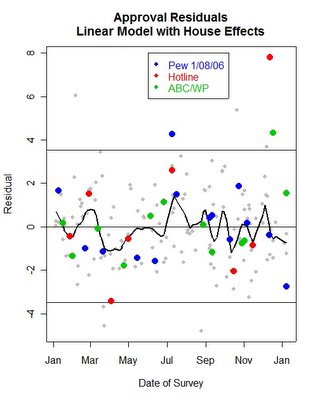
First, he points out the Bush approval rating reported by the Pew Research Center (38% approve) looks to be a bit of an outlier, that is, “[an] unusually low reading of President Bush’s approval compared to most other polls.” The five conventional national surveys released this week show an average 42% approval, so the Pew Center is about as much of an outlier (38%) on the low end as the ABC/Washington Post poll is on the high end (46%). Franklin goes into great detail about what his regression models tell us about the Pew poll specifically and the topic of statistical outliers generally. His conclusion, in this case, is that once we take “house effects” into account (in the graphic reproduced below), the Pew survey still remains “comfortably within the 95% confidence region” of the other recent polls, although obviously lower than average.

Second, Franklin has also had a series of posts about what his regression models say about the current trend in Bush job approval rating. This task is not an easy one. One big challenge comes from those pesky “house effects” that make some polls consistently a bit higher and some a bit lower on Bush’s approval. Since the different organizations poll on widely varying schedules, their timing can influence the apparent trend. If anyone is qualified to use regression analysis to puzzle all of this out, Franklin is, but the difficulty is apparent. As of yesterday his models indicated the upward trend in Bush’s ratings had slowed but not stopped. Today he ponders whether Bush ratings may be declining again (as compared to mid-December). I know I have oversimplified his analysis, so read it all for the details.
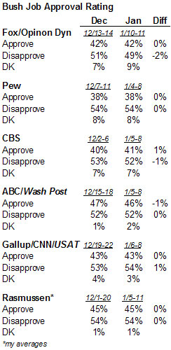
My own approach is less sophisticated but perhaps a bit safer. Ideally, I prefer to look at trends one pollster at a time, and then see if consistent pattern emerges across all organizations. So here is the table I have posted in several forms all week, updated to include the new Fox News poll (story, full results) and my own averages of the Rasmussen automated tracking. All six organizations were in the field in early or mid-December and again in the last week or so.

None of the surveys show trends in any category of more than two percentages points, variation that falls well within the sampling error for any individual poll. And collectively, one pollster shows a one point increase in the percentage expressing approval, one shows a one point decline, and four show no change whatsoever. In terms of net approval (approve minus disapprove), two show slight gains, two show slight drops and two show no change. The pattern looks to MP like nothing more than random noise since December. The Bush job rating certainly rose during November after a sharp decline in October. However, if the Bush approval rating has been trending consistently in any direction over the last month, MP cannot see it in this data.
You are such a Bush lackey it’s amazing. Don’t hide behind the “Democratic” pollster label anymore. It’s getting old. Never miss an opportunity to take an opportunity to make Bush look good. Are you actually working for any Democrats now? I can’t imagine what service they’re getting.
Just admit it, you’re pro Bush, pro Republican, pro status quo.
It’s often helpful to keep in mind both the change since the last poll (as you did above) and the timing of the last poll. Here’s a plot that does that, for net approval (i.e., approval-disapproval):
http://anonymous.coward.free.fr/polls/bush05.png
In each panel the red dots are that firm’s polls. The smooth line is calculated *without* those polls, so it gives you a rough idea of how much influence each firm or any particular outlier has on the overall pattern.
I look at net approval both because it’s a quick way to control for differences in undecideds and also because a change in disapproval can presage a change in approval (when the undecideds are many).
The plot is current up to yesterday’s Fox poll.
Someone named Todd wandered through here last night, dropping a comment that was obviously intended for another site. If anyone knows Todd, or has any idea where he meant the comment to be placed, please come forward so I can put the comment where it belongs.
Yeah… Bush is naturaly born cowboy…