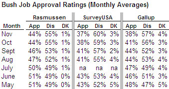
I want to follow-up briefly on one point raised by yesterday’s post on recent patterns in the Bush job rating. Professor Franklin’s graphic showed that the automated Rasmussen tracking poll have shown a consistently higher approval percentage than other polls since March of 2005. I want to consider one possible explanation — involving the lower than average “don’t know” response on the Rasmussen Reports surveys — that at first glance does not seem to explain the difference.
Scott Rasmussen kindly replied with an email yesterday. It answered some of my questions on how they weight by party (something I will follow-up on in a subsequent post) but also raised one possible reason for the consistently higher Bush approval rating:
I note that our polls frequently have fewer “not sure” or “undecided” respondents on the Bush Job Approval questions. If you take a look at the 4 most recent polls listed on RealClearPolitics.com and measure the percentage of those with an opinion, the gap between our numbers and others grows smaller (In fact, Fox ends up almost exactly even with us). What that means, I’m not sure, but it is something that has been fairly consistent over time. I’ll be curious to hear your thoughts on this.
Rasmussen is certainly right about the lower “don’t know” response on his surveys. I created the table below to compare the Rasmussen results for the Bush job rating to other readily available results. I calculated a monthly average for the Rasmussen and Gallup surveys (the latter based on 3 to 4 polls per month) and also included the monthly national result reported by SurveyUSA (usually fielded over 2 to 3 nights in the middle of the month). Rasmussen typically reports 1% or less in the “don’t know” category compared to 4% for both SurveyUSA and Gallup.

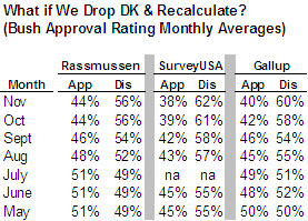
Rasmussen is also right that dropping the “don’t know” responses and recalculating the job ratings does narrow the gap. However, as the table below shows, a gap still remains at least as compared to both Gallup and SurveyUSA. Rasmussen’s approval number for Bush is higher than each pollster in every month, by an average of 2 percentage points compared to Gallup and by 6 percentage points compared to SurveyUSA.

Putting aside the issue of how to allocate the “don’t knows” for a moment, let us consider the reasons why Rasmussen might show a lower “don’t know” response in the first place. I can think of several possibilities or hypotheses. Perhaps readers can suggest more.
One is that the lack of a live interviewer makes it easier for respondents to offer an opinion. Perhaps a small percentage of respondents are reluctant to share their opinions with a stranger but feel more comfortable doing so with a computer. The problem with that theory is that SurveyUSA also uses an automated, interviewer-free methodology, but their “don’t know” response is higher (~4%) and consistent with other interviewer based surveys.
A second possibility might be that Rasmussen’s implementation of the automated methodology (known more formally as Interactive Voice Response, or IVR) makes it harder for respondents to offer a don’t know response. The problem with that theory is that Rasmussen’s interview presents the “don’t know” option to respondents in a very straightforward way. Here is the text that Rasmussen provided to MP:
How would you rate the job George W. Bush has been doing as President… do you strongly approve, somewhat approve, somewhat disapprove, or strongly disapprove of the job he’s been doing?
If strongly approve, press 1
If somewhat approve, press 2
If somewhat disapprove, press 3
If strongly disapprove, press 4
If you are not sure, press 5
According to Rasmussen, “not sure” is always the last option and they read it “without any pause or delay.” For what it’s worth, on surveys that use a live interviewer, the “don’t’ know” response is typically voluntary. Interviewers are allowed to accept “don’t know” or “not sure” as an answer, but do not offer it as a possible choice.
A third and more compelling theory is that Rasmussen’s job approval question differs from other pollsters in a way that makes it easier for respondents to answer the question. Note that Rasmussen offers four possible answers (“strongly approve, somewhat approve, somewhat disapprove or strongly disapprove”), while almost all of the other national pollsters initially ask respondents to choose between just two categories (“approve or disapprove”). “Somewhat approve” is a very soft choice and probably an attractive option for the very small percentage of Americans who have trouble expressing an opinion. It may be easier for them to say they “somewhat approve” of the President’s performance than to choose between “approve” and “disapprove, and thus in theory, Rasmussen gets a bigger “approve” number.
Although I find this theory more plausible, it still cannot explain all of the difference between Rasmussen and other pollsters. A consistent gap would remain — especially with SurveyUSA — even if we allocated all of the “don’t know” response to the approve category.
Moreover, Gallup’s Frank Newport and David Moore offer a good reason why we might not want to allocate the “don’t know” responses to the approval column. In a (free) Gallup Blog post last month, they show that on recent national surveys by ten different conventional pollsters (e.g. using live interviewers), the “approve” response for President Bush tended to be consistent, while there was much play between “disapprove” and “unsure:”
[T]he “action”, so to speak, seems to be more in the disapproval column, suggesting that when a poll — for whatever reason — has more people who say they are unsure in response to the Bush approval question, that poll tends to have lower disapprovals. This suggests that approval of Bush at this point is more certain, while there is more “floating” between disapproval and simply saying one does not know.
This leaves MP with two more hypotheses that might explain why Rasmussen typically shows a higher Bush approval rating than other pollsters. Both involve the possibility that Rasmussen’s samples have a consistently different composition.
One is that that Rasmussen’s robots get more refusals and drop-offs than other surveys among Americans who tend to be less opinionated. Perhaps the kind of people who might stay on the phone with an interviewer, but hang up on a robot, include a disproportionate number who have trouble answering survey questions.
Another is that Rasmussen, who weights every survey by party identification, is setting the level of Republican identifiers higher than other surveys.
I want to examine both possibilities more closely in subsequent posts.
I haven’t looked at the Rasmussen data, but I have looked at house effects and undecided percentage. Here’s a little graphic that shows box plots of undecideds for polling firms. The plot focuses on the period after October 1, 2001; before that, undecided percentages tended to be quite high.
http://anonymous.coward.free.fr/polls/undecidedbox.png
Charles has discussed box plots before, but the quick explanation is that they tell you something about the range of values, with the body of the body showing the interquartile range (i.e., between the 25th and 75th percentiles) and the little line across the middle of the box showing the median.
As you can see, Zogby and Harris tend to have very low undecideds; TIPP, Pew, and Fox tend to have relatively high levels of undecideds.
For comparison, here is my estimate of overall house effects based on net approval.
http://anonymous.coward.free.fr/polls/apresidbox.png
“Another is that Rasmussen, who weights every survey by party identification, is setting the level of Republican identifiers higher than other surveys.”
Bingo.
I think there has been some movement in the partisan balance post-Katrina, and Rasmussen’s weighing would certainly explain why he’s fallen out of sync.