Earlier in the week, MP posted links to the latest surveys by USAToday/Gallup and CBS News and anticipated an updated trend chart that our friend Charles Franklin delivered as expected later that day. Unfortunately, a challenging week of travel and day-job distractions prevented me from checking Franklin’s site until today – the updated chart appears at the end of this post. However, I also discovered an amazing analysis that Franklin did earlier in the week comparing the current Bush job rating to the mid-term ratings of other Presidents since 1950. His conclusion is a bit stunning, even for those of us who obsess over such things: “We have simply never seen a president this unpopular going into a midterm election.”
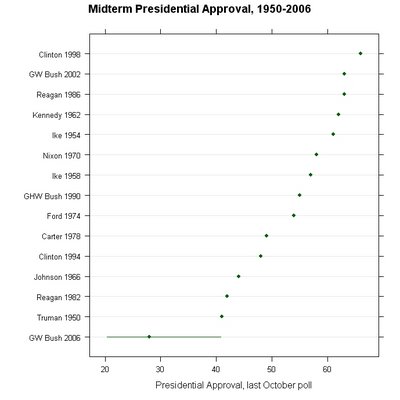
As usual, one of Franklin’s pictures is worth a thousand words. Here is the money graphic following by his description:

President Bush’s approval rating is on course to set a record low for mid-term elections. The magnitude of the problem is greater than commonly perceived. The previous record low approval in the last Gallup poll of October was 41% for President Truman in 1950. Based on approval trends in 2005-06, the President and Congressional Republicans are facing an election day 2006 approval of between 20.4% and 40.8%.
He goes on to explain how he used past trends in the Bush job approval rating to try to project a range of potential ratings conceivable by October, illustrated as the line at the bottom of the chart (above) that extends in both directions from the “GW Bush 2006” point. But whatever guess one wants to make about what the Bush rating will look like in October, it is hard to argue with his conclusion:
I was frankly shocked at the above results. Other presidents have suffered low approval ratings, and President Bush still stands above the lows of four of the ten other post-war presidents. But I had not appreciated how much the current approval is below other mid-term approval ratings, even without extrapolating current trends. We have simply never seen a president this unpopular going into a midterm election.
Well, actually, as a commenter on Franklin’s site points out, he started with 1950 and thus missed the low of Harry Truman — 33% in September 1946. That is not company George Bush wants to share. In 1946, Republicans won 55% of the congressional vote and took control of both houses of Congress and a majority of state governorships.
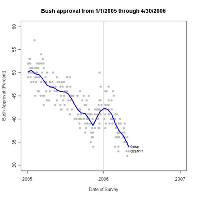
Meanwhile two new polls have been released since my last post earlier this week: The R-T Strategies poll puts the Bush job approval rating at 36% (results, crosstabulations, presentation) and a new AP-IPSOS survey out today reports it at 33% (AP story, results). Franklin promises an updated trend chart later today, but meanwhile, here is his version from earlier this week:

I would like to see a comparable chart showing the relative approval ratings of those same presidents vis a vis their respective Congress(es?). I believe the real story in the government approval debacle is not in the President’s numbers but in the abyssmal ratings of the entire Federal government. The President’s ratings continue to be the best of the four rating entities (President, Congress, Dems, Reps).
The public wants the president to perform to the public’s comfort level. They want the president to only do things that they are comfortable with. Lower taxes, create more jobs, goverment give-away programs, make nice speeches, look good in public.
Sometimes the president has to do things that are unconfortable. Protect our nation. Prevent terrorist attacks on our soil. Jobs that are not without a price to the public and thus uncomfortable. It hurts to send young men to a foreign country where they may die in combat. Protection has always been costly but no-protection is the costliest of all the solutions. With the forces that want to see us destroyed we must learn to live with some discomfort and be glad we have a president who does what is right and not what is popular.
Dave Williams
Dave,
MP is devoted to understanding and analysing polls. Where in your post do you address anyting like this issue?
-tylerh
p.s. If you must post off-topic, could you please have the good taste to post something that doesn’t read like a cut-and-paste talking point? Thank you.
I think there is less to this graph than meets the eye. Don’t approval ratings often increase once the office holder starts actively campaigning?
The (massive) error bars are on honest attempt to capture this unknown, but I think a more useful graph would also include a data point for the poll ratings in May before mid-term election.
Tyler,
You might want to check out Franklin’s follow-up which plotted approval in May for each president against the number of House seats gained or lost in November:
http://politicalarithmetik.blogspot.com/2006/05/approval-and-midterm-seat-loss-problem.html