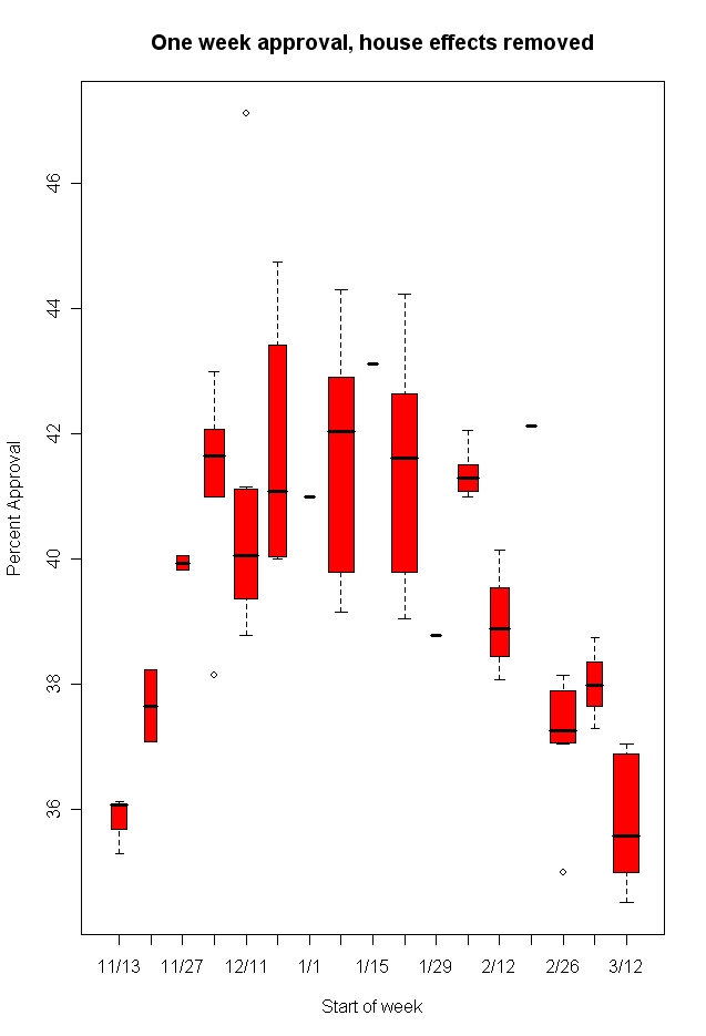
Last week, in looking at the graph of the Bush approval rating data as plotted by our friend Prof. Charles “Political Arithmetik” Franklin, I asked what seemed like a straightforward question: Did the recent changes represent an abrupt downward shift in late February that has since leveled off, or slow gradual decline as indicated by Franklin’s trend line? Gallup’s Frank Newport, in examining their data only, seemed to agree that the decline had leveled off. Yesterday Franklin posted a long and incredibly detailed answer that indicates that the decline has continued into March. Of course, as always, what the trend will look like going forward is anyone’s guess.
Franklin’s high powered analysis is not for the statistically faint feint of heart, and his approach to attacking my question is as wonky as this sort of thing gets. But the bottom line is that no matter how Franklin crunches and plots the data he still sees “continued downward movement and not stabilization.” He also finds that the “house effects” of the polls conducted in recent weeks (“the tendency of different polling organizations to find approval ratings higher or lower than the average”) may be contributing to my perception of stability in recent weeks. “With house effects removed,” Franklin sees “no evidence that the decline in approval has hit a steady state.”
Of the nine different graphics in Franklin’s post, my favorite is this “low tech” box-plot, which shows the range, the median (the heavy black line in the middle of most boxes), and the 25th and 75th percentile (the box) of all the polls conducted each week since the beginning of the year with house effects removed. While the boxes for the last three weeks overlap, the medians show a small continuing decline over the last three weeks.

Two final thoughts: First, as Franklin stresses, the recent trend tells us nothing about what the future holds.
[M]y models here are not intended to predict future events. My goal is to clarify what the data show has happened. I’m pretty sure approval has continued down.
Second, in a comment on one of my posts on this subject earlier in the week, Robert Chung makes an important point about the limited statistical power of individual surveys:
I’d expect that two polls taken by the same firm only a few days apart with a reporting resolution of only 1 percent *ought* to look pretty much the same…Basically, with sample sizes of roughly 1000, it would be unusual (but not impossible) for any two closely adjacent polls to be significantly different. Because Gallup tends to poll more frequently than others (see http://anonymous.coward.free.fr/polls/gross-vs-net.html ), its time interval between polls tends to be shorter. That’s the kind of situation where *even if approval were changing smoothly* you’d expect to see step-like behavior.
Again, Franklin’s discussion gets pretty wonky, but for all of us who consider ourselves students of data analysis, it’s worth reading in full.
PS: While visiting Franklin’s blog, don’t miss his similarly powerhouse look at changes in party identification over the last year, the second in a series on party ID. He shows a year-long trend toward decreased Republican identification mirrored by an increase in independents that is consistent across the surveys conducted by 11 different pollsters.
‘Feint’ of heart?
I would trust the graphics.